The Challenge
Translate a popular entertainment collaboration into a cohesive digital experience that connects storytelling with product discovery across multiple channels.
Web Design · Digital Campaign · Graphic Design
A screen-to-brand collaboration.
Byeol Kim
KISS
Web Design · Digital Campaign · Graphic Design
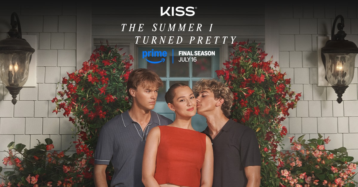
The Summer I Turned Pretty × KISS
Translate a popular entertainment collaboration into a cohesive digital experience that connects storytelling with product discovery across multiple channels.
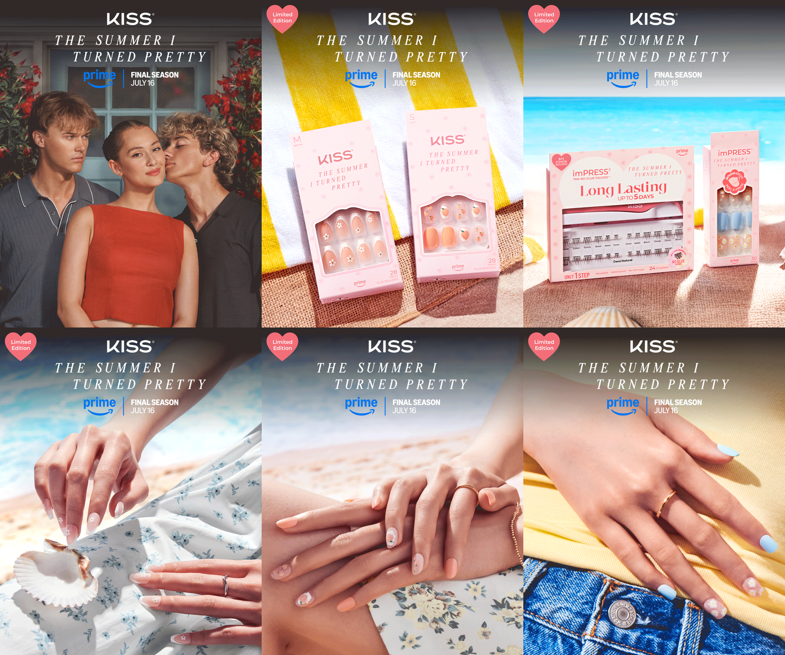
Created a unified visual direction across campaign landing pages, email, social, and retail assets, balancing the series-inspired aesthetic with clear product messaging.
Delivered a coordinated suite of digital campaign assets across brand-owned and retail platforms, creating a consistent experience across customer touchpoints.
As part of the KISS and imPRESS digital collaboration with The Summer I Turned Pretty, I led the design of a dedicated landing page that brought the series and our nail brands together through a curated product experience. The goal was to deepen engagement with the show’s core fan base while introducing the series to new audiences through an accessible and immersive digital experience. By connecting KISS and imPRESS nail products with the world of The Summer I Turned Pretty, the page gave fans a new way to engage with the series and experience the story beyond the screen.
Lead Web Designer
KISS and imPRESS Brands
Duration: 5 Weeks | Revisions: 2 Rounds
Team Collaboration: Marketing, Product, E-Commerce, Development

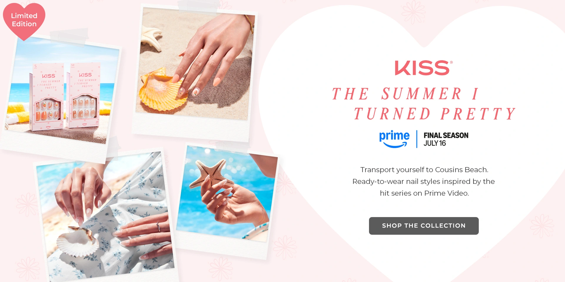
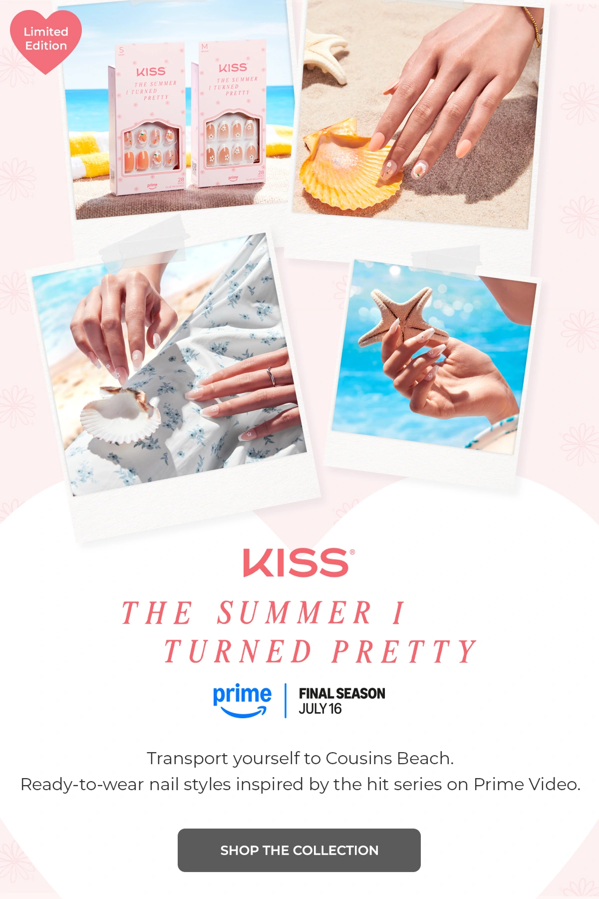
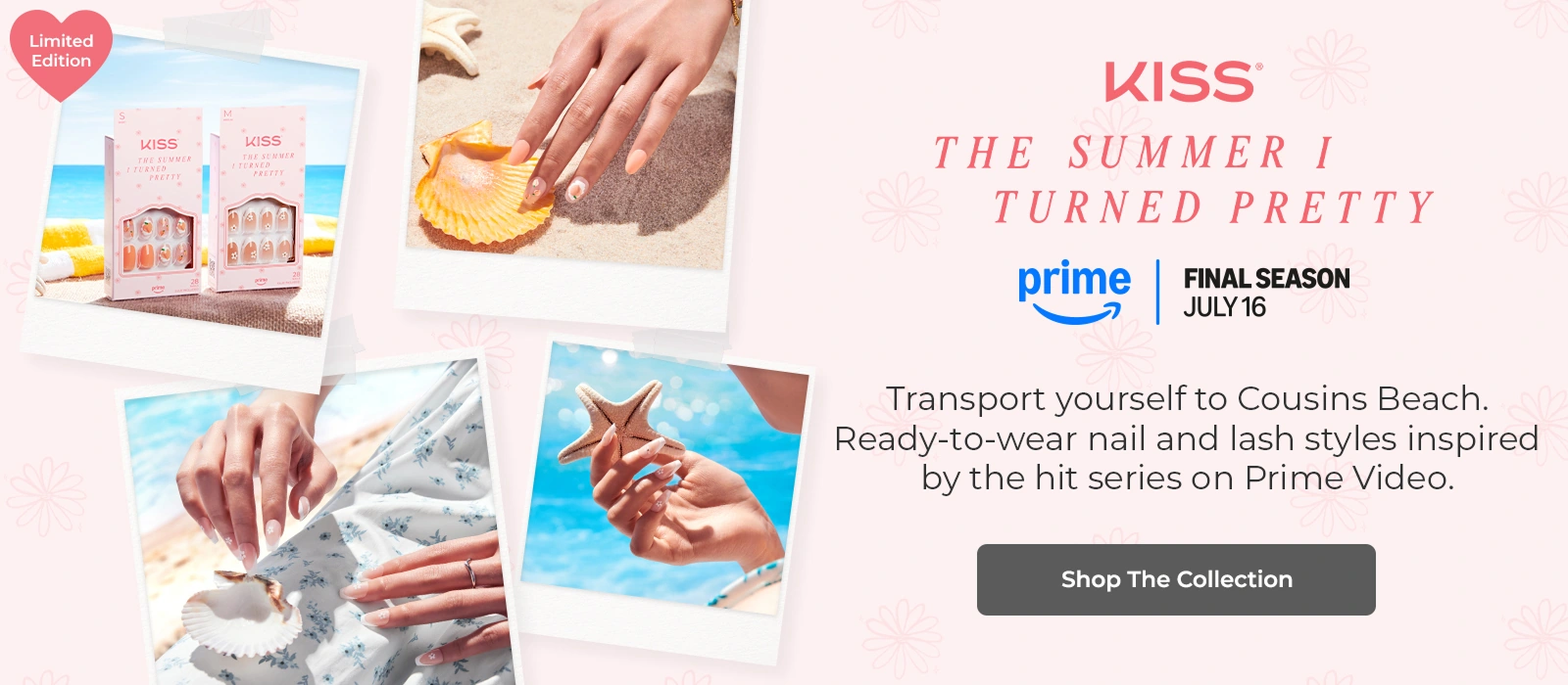
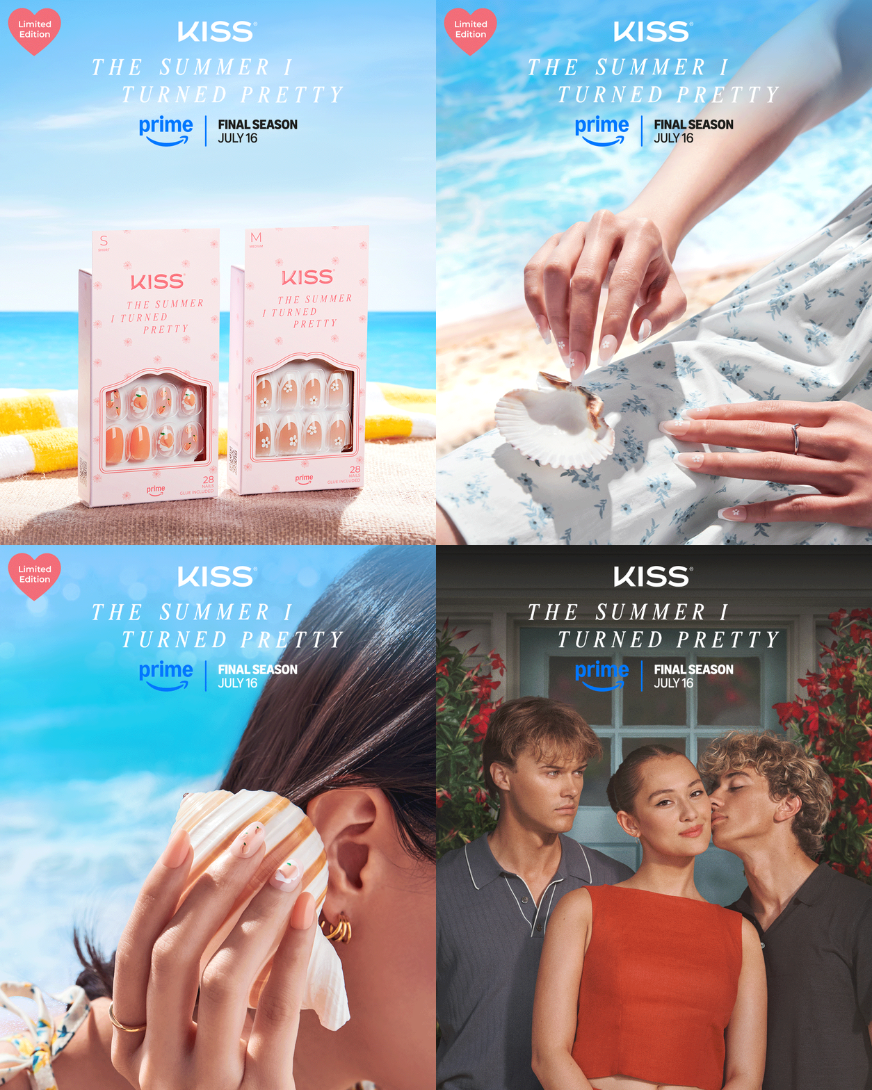
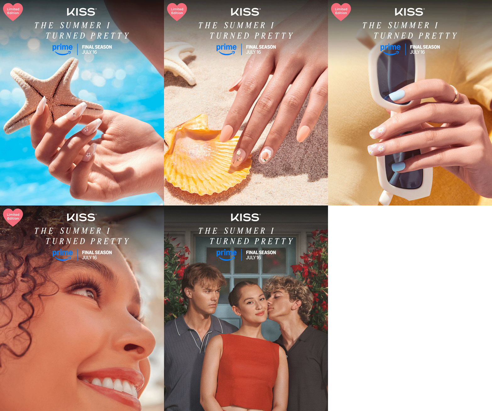
Desktop and mobile campaign banners presented within the imPRESS website header, followed by the TikTok placement.

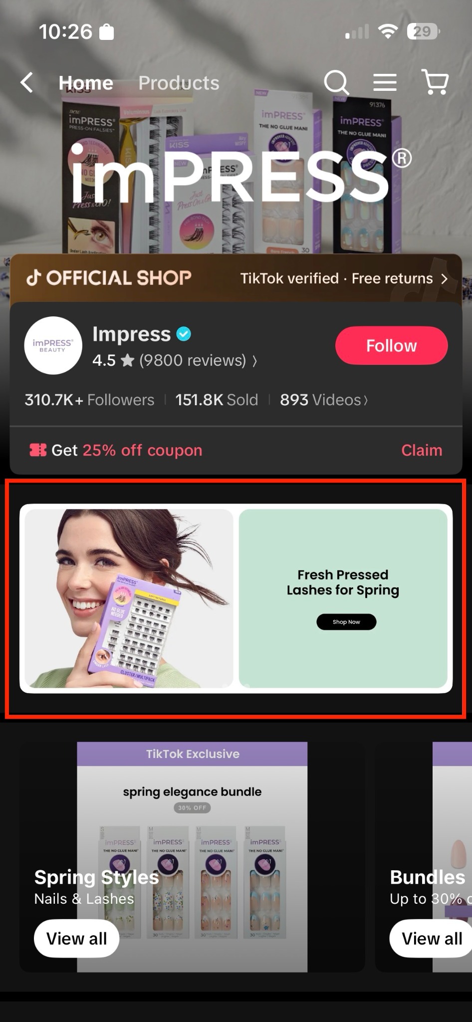
The campaign banner within the imPRESS TikTok Shop storefront.
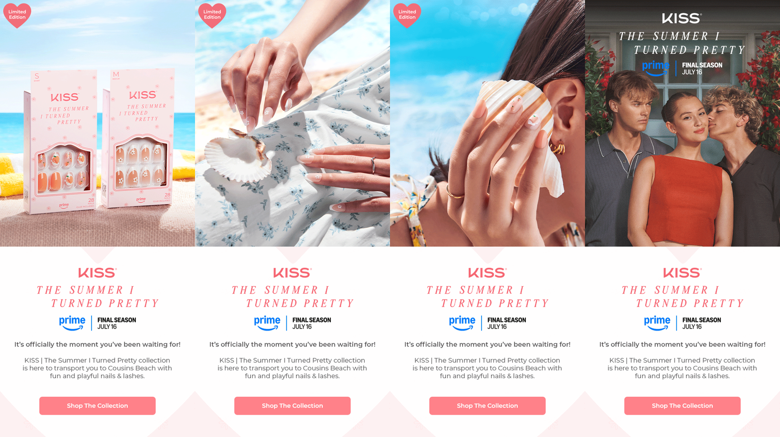
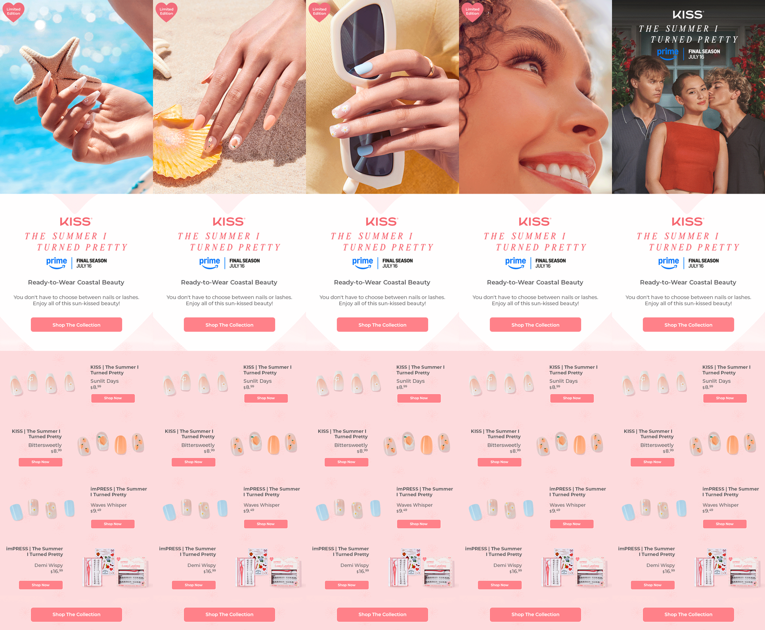
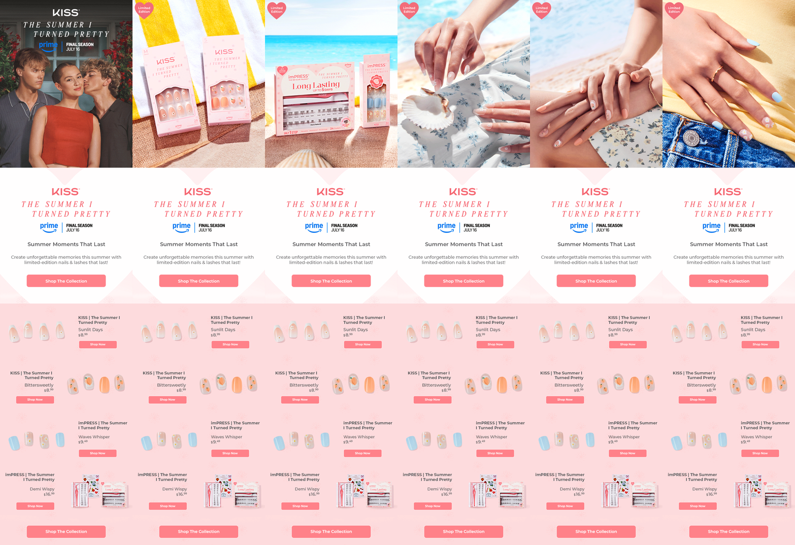
Three animated email creatives supporting the collaboration. Scroll inside each mockup to explore the full email.
Three animated creatives designed for SMS campaign messaging.
Text Message · SMS
Today 9:41 AM
Your summer story starts here. Discover the KISS × The Summer I Turned Pretty collection.
Explore the collection Reply STOP to opt out.Text Message · SMS
Today 9:41 AM
Meet your next summer favorites. Explore nails inspired by The Summer I Turned Pretty.
Explore the collection Reply STOP to opt out.Text Message · SMS
Today 9:41 AM
Bring the story beyond the screen. Shop the KISS × The Summer I Turned Pretty collection.
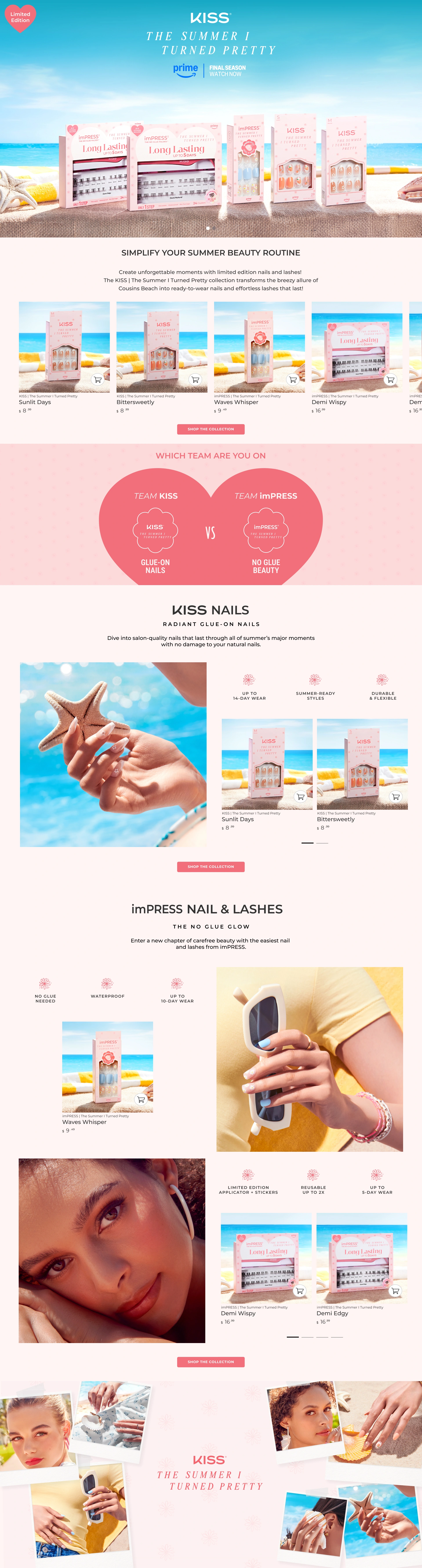
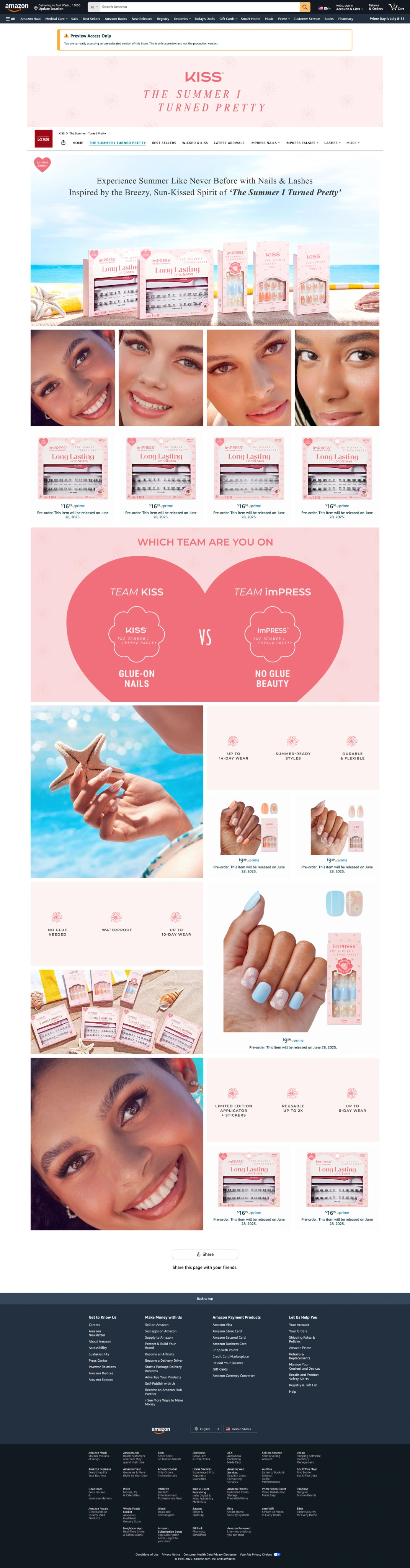
Explore the collection Reply STOP to opt out.I designed the Amazon storefront, product thumbnail content, and desktop and mobile Premium A+ layouts for the KISS and imPRESS collaboration with The Summer I Turned Pretty. The experience brought the campaign’s coastal visuals into a product-focused shopping journey, connecting the collection’s story with the details shoppers need to explore each product.
My focus was on campaign storytelling, clear product education, and a cohesive desktop-to-mobile experience. Lifestyle imagery introduced the collection, while benefit highlights and step-by-step application visuals balanced the emotional story with practical product information.
The final design connected storefront discovery, product exploration, and application guidance through one consistent visual system. Dedicated desktop and mobile layouts carried the campaign’s summer atmosphere across formats, with product benefits and usage instructions presented alongside the collection imagery.
The Summer I Turned Pretty
No-glue press-on nails
Explore summer-inspired nail designs and collection details.
primeThe Summer I Turned Pretty
Glue-on nails
Explore summer-inspired nail designs and collection details.
primeThe Summer I Turned Pretty
Glue-on nails
Explore summer-inspired nail designs and collection details.
prime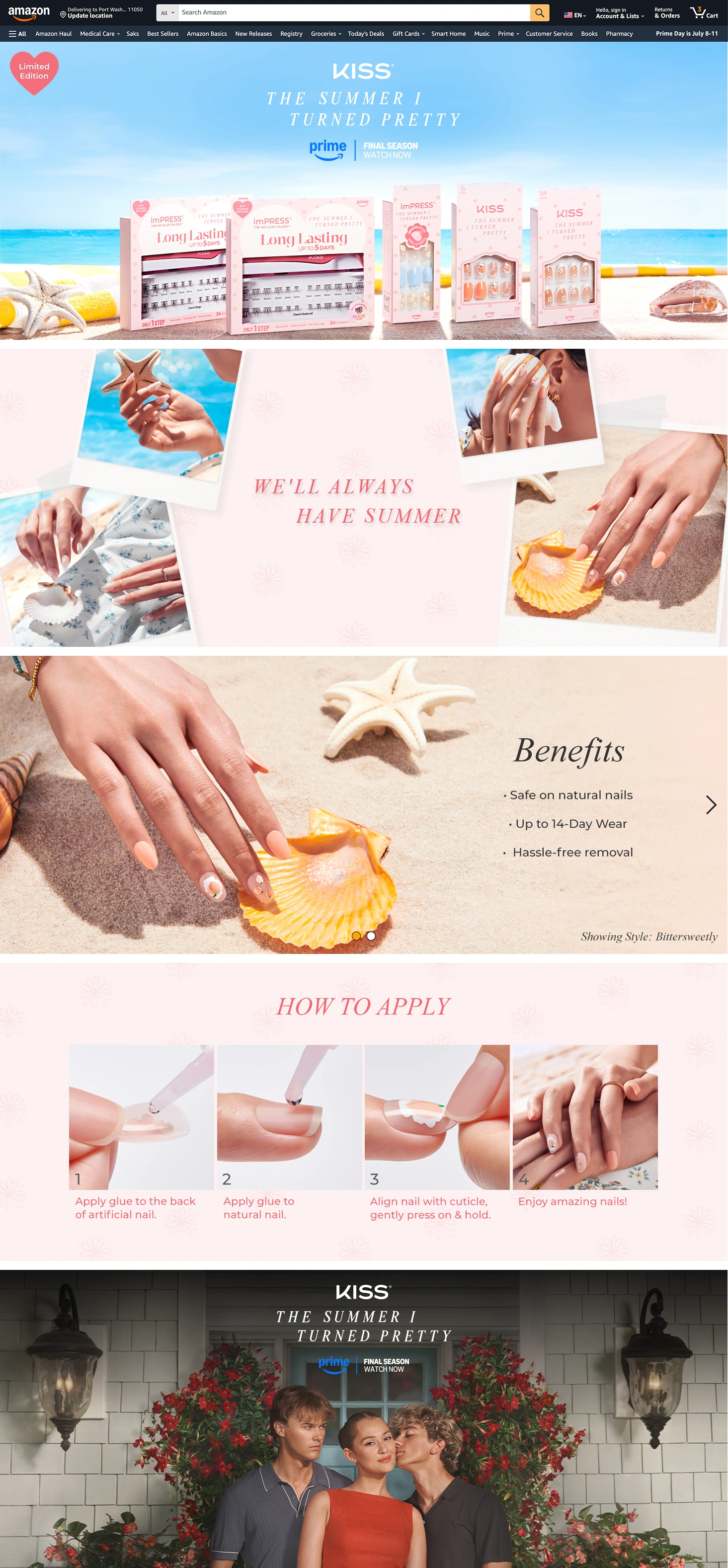
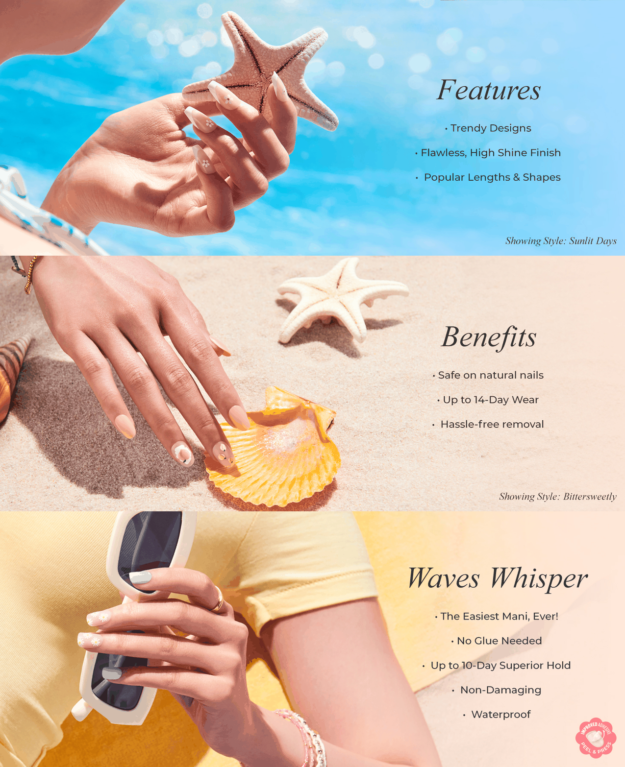

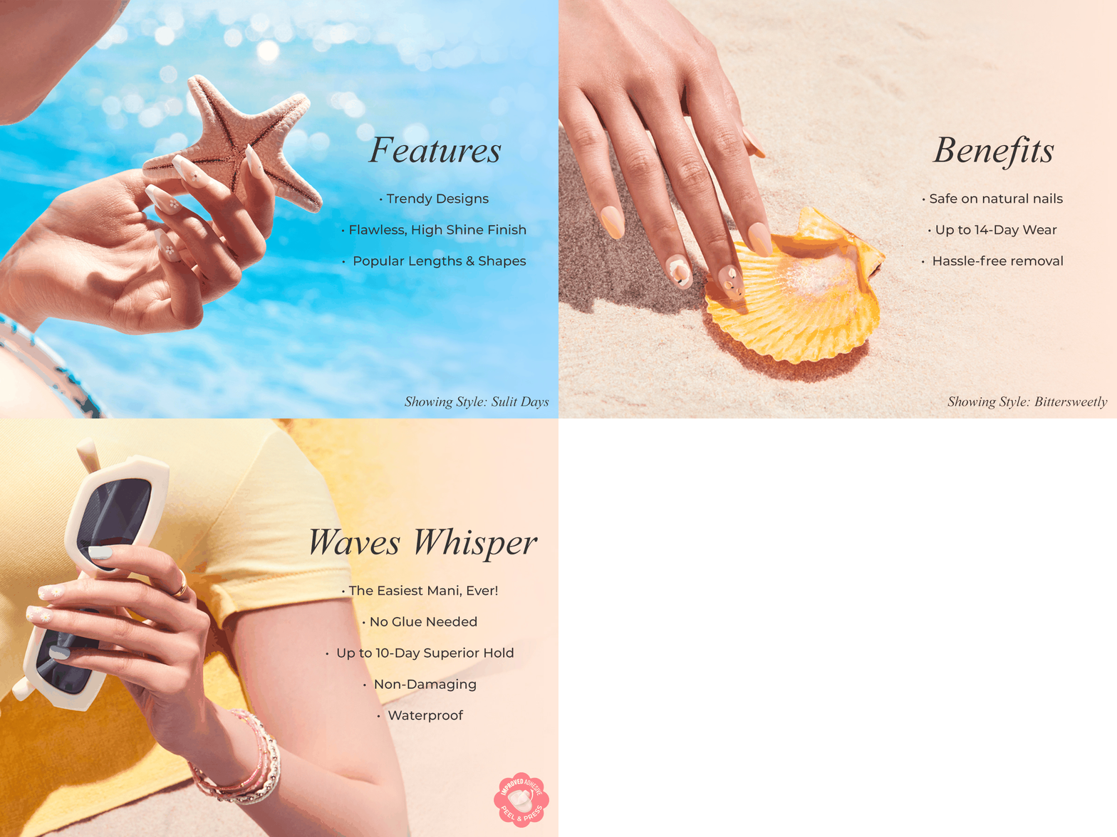
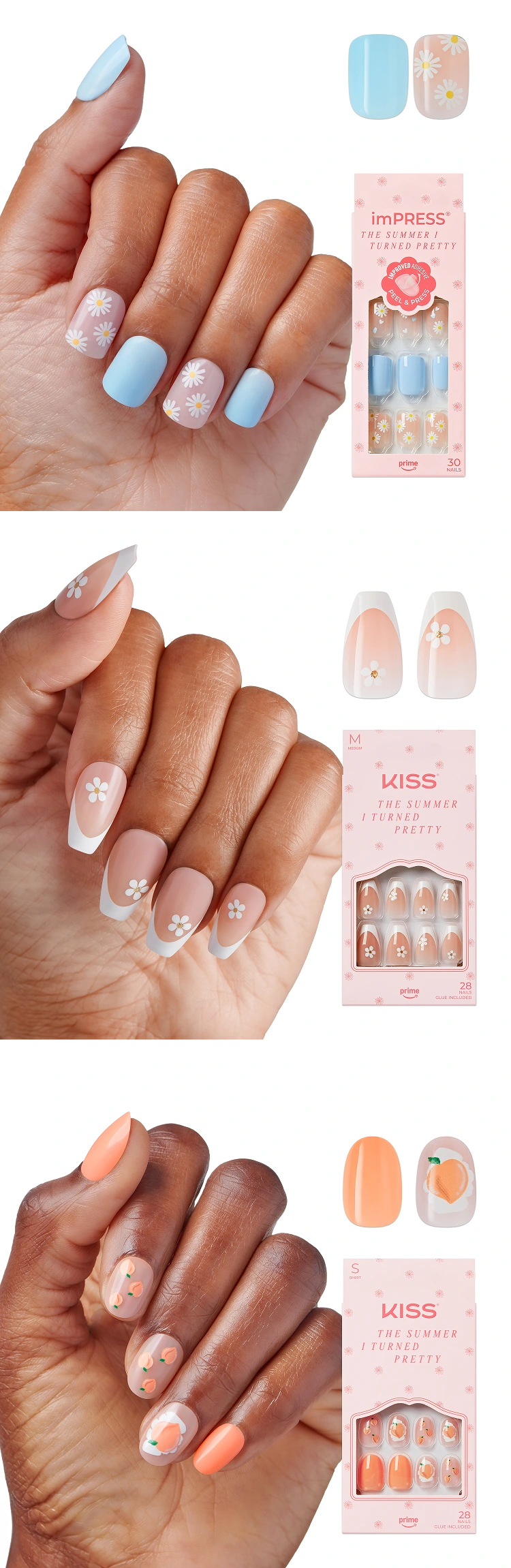
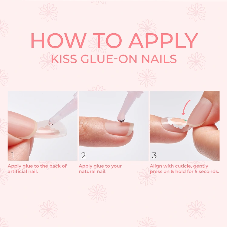
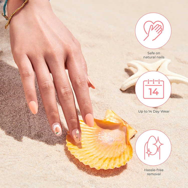
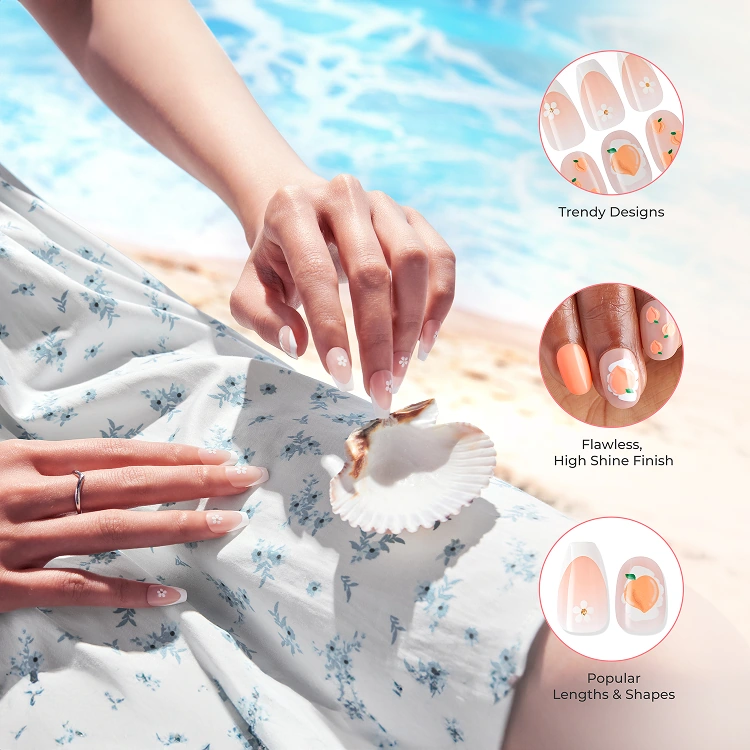
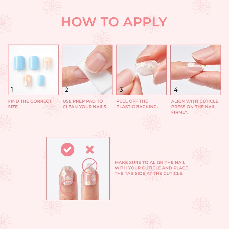
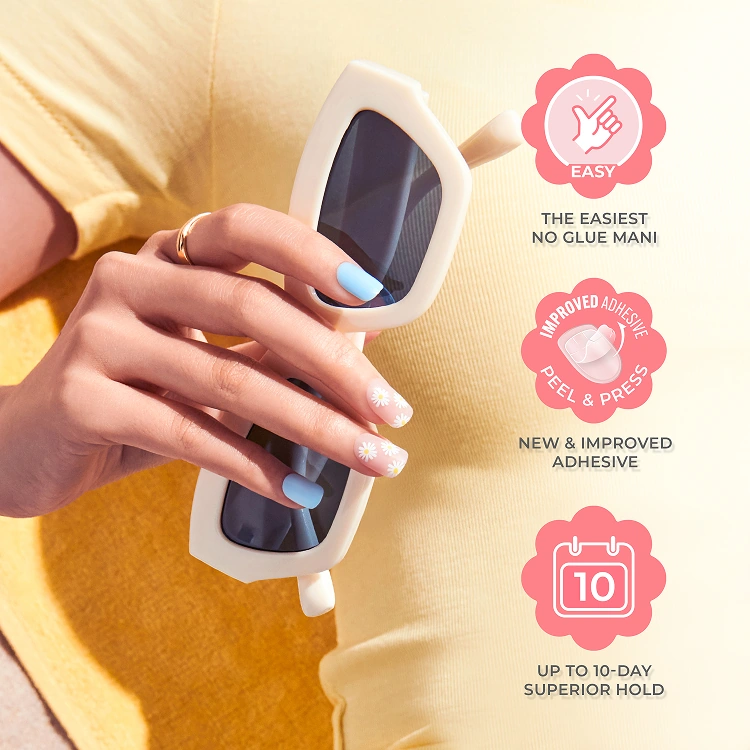
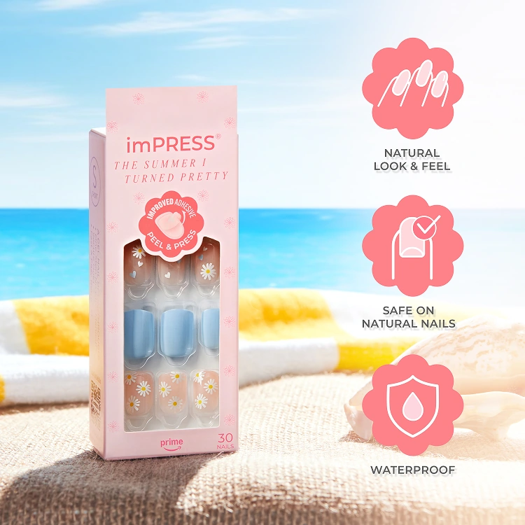
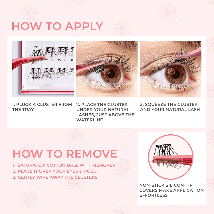
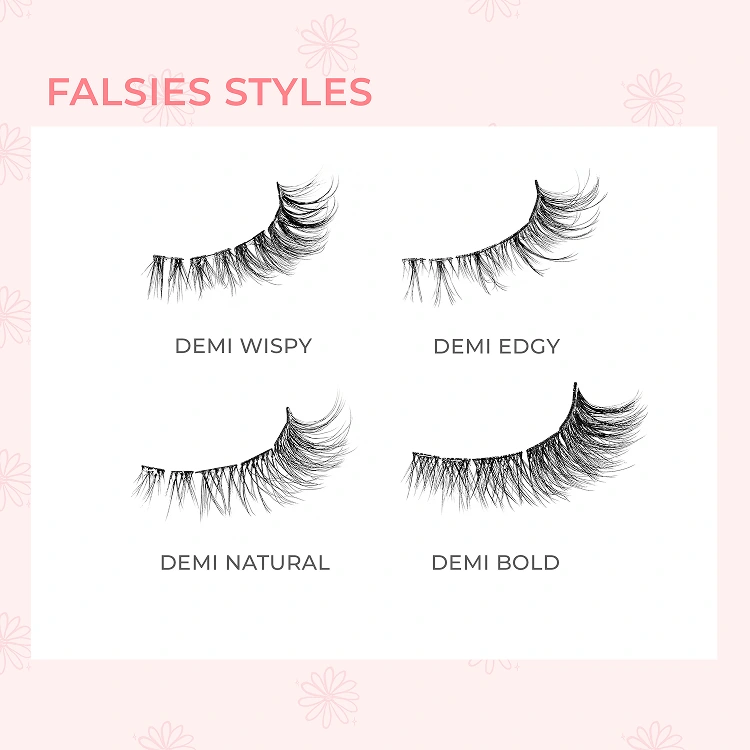
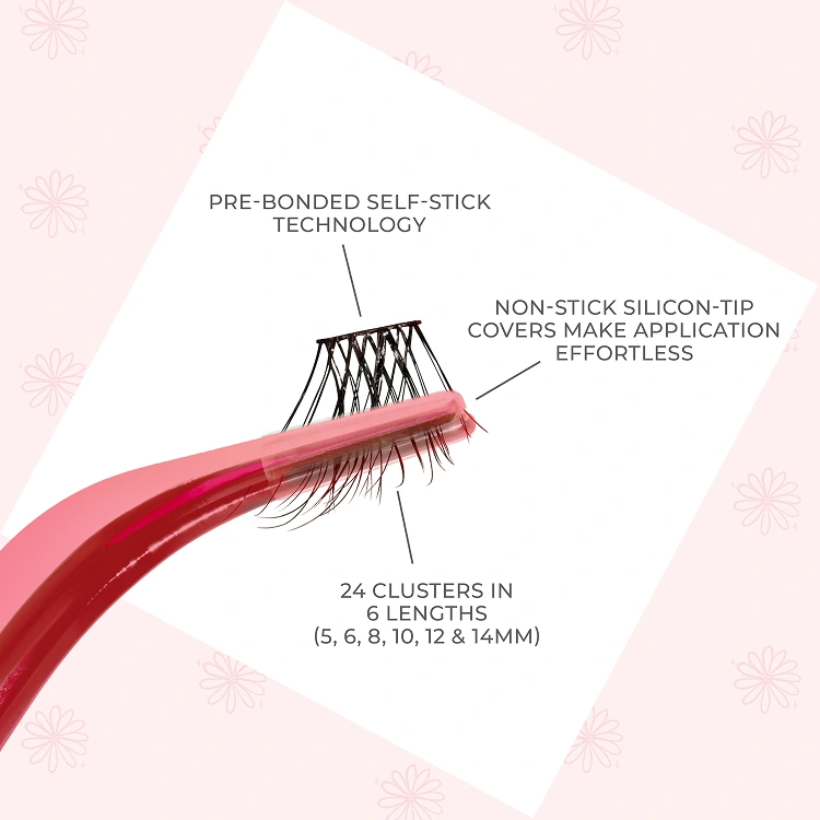
I created product-focused infographics for the KISS and imPRESS The Summer I Turned Pretty collection to make product benefits, styles, and application steps easier to understand. Across nails and lashes, the visuals paired campaign imagery with concise explanations, giving shoppers practical information alongside the collection’s story.
The design was built to support the path from product interest to purchase: benefit graphics communicate value, style visuals help shoppers explore their options, and application guides address how the products work before customers commit to buying.
These assets were designed to reduce purchase hesitation and support informed product selection by answering common product and usage questions visually. Their role in the sales journey was to connect campaign interest with the information shoppers need to make a purchase decision.
Social content
04 ASSETSProduct-focused graphics for KISS and imPRESS nails and lashes.
🏆 Award Winning NO GLUE Press-On Nails
🐇 Cruelty-free & Vegan
💖 Find us at @walmart @ultabeauty @target @cvspharmacy